So, if we want to find some good matches for our colour, what do we need? Colour wheel is a good tool. For example, this one (from Wikimedia):

A good explanation of using a colour wheel can be found here and here.
OK, how to make it work?
I chose ink blue. It's basically a dark shade of blue with a little bit of violet (and BTW, violet and purple are entirely different colours). There are 15 combinations I used:
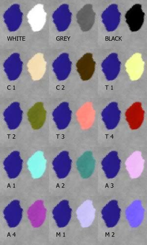
1. With white - it's a fail-safe option. Wearing white with dark blue looks very classic, formal and a little bit boring, if you ask me. Actually, I think that you can wear any colour with white (which is considered neutral).
2. With grey - another neutral. It's less contrasting than the first combination and therefore looks softer. Same as above - you can wear everything with grey (although I prefer that specific shade of blue with white).
3. With black - probably the most used colour combination. People wear lots of black, with me not being an exception. Wearing a saturated colour with black looks dramatic.
Those three are not really colours. OK, so which one should you use? It depends. For example, I'd wear rose with grey (because both are soft), salmon pink with white (because both are light and "happy") and fuchsia with black (because both are dramatic). I have a feeling that black works better with cool colours, while white works better with warm colours. Of course, you can substitute off-white for white, or charcoal for black. My ideas are suggestions, not rules.
4. Complementary colour of opposite value (C1) - being tan/warm beige/light orange. You don't need to choose an exact match. This combination is very eye-catching and doesn't really fit everyone (especially, if the colours are very saturated). For me, the best combination is probably strawberry red with emerald green - because it repeats my skin undertone and cool, grey-green eyes.
5. Complementary colour of similar value (C2) - that will be very dark orange, which is, in fact, brown. This is a safer combination and works very well, if your natural colouring is similar (in our case, this would be probably a perfect outfit for a blue-eyed brunette).
6. Triad of opposite value (T1)- just as the name says, there are three colours in a triad. Light, lemon yellow or lime. The overall feeling is quite cool (as it contains no red tones). You can find a warm example too (like warm pink and pumpkin).
7. Triad of similar value (T2) - olive. I've got mixed feelings about this combination. It would probably look better in a pattern and not as two solid blocks of colour.
8. Triad of opposite value (T3) - coral. As you probably noticed, our triad is similar to the primaries (red, yellow, blue), but subtly shifted clockwise. This means that our T3 colour is red, mixed with a little bit of orange and a good bit of white. This is a nice combination too, similar to C1, which makes it work if you don't like the C1 colour.
9. Triad of similar value (T4) - maroon. Another nice combination, if you ask me. Looks simple and classic, while not being as formal as the first combination (with white).
10. Analogous of opposite value (A1) - turqouise or mint. This combination makes me think of sunlit ocean water. A good idea if you want to add some life to your outfit, but you're afraid of contrast. This particular combination is cool, but there are some warm ones as well (like rust and cream).
11. Analogous of similar value (A2) - teal. The difference is subtle. You can add a complementary colour (ink blue and teal clothes plus light beige accessories).
12. Analogous of opposite value (A3) - cool pink. Despite the high contrast, it looks fresh and feminine.
13. Analogous of similar value (A4) - dark purple. If you mix analogous colours of similar value, keep in mind that both should be EITHER clear OR soft. So, mix royal blue and royal purple, but not ultramarine and plum. You can use both analogous colours and wear a blue dress, teal shoes and a purple cardigan.
14. Monochromatic (M1) - our shade is dark. This means that we can combine it with a light or a bright colour. This example is light.
15. Monochromatic (M2) - and now, a bright colour. If you have a monochromatic outfit, you can add accessories in every colour mentioned above.
Whew. This polyvore is an example of all 15 combinations (some of the choices are not that good style-wise; look only at the colours).

Which are your most and least favourite? And how do you combine colours?
No comments:
Post a Comment